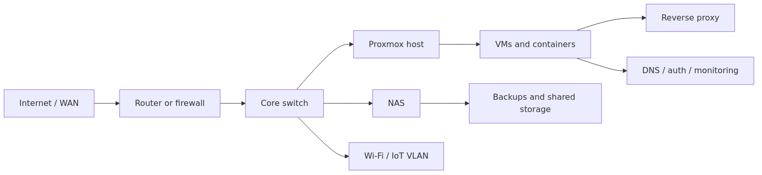
Homelab Network Diagram Template: Track Hosts, VLANs, and Services Clearly
Use a simple homelab network diagram template that maps internet, router or firewall, switches, hosts, VLANs, and the services or storage paths you actually need to troubleshoot.
Transparency note: This guide contains no affiliate links. If we ever add product recommendations later, we will disclose that clearly.
Documentation basis: This workflow is grounded in the Mermaid flowchart syntax reference, the Mermaid usage documentation, and the broader documentation discipline used across HomelabAddiction remediation work. No enterprise network-mapping claims are made here unless explicitly stated.
A useful homelab network diagram tracks the path you repeatedly troubleshoot: WAN edge, router or firewall, switching core, compute hosts, storage, VLANs, and the handful of services whose relationships you forget first.
The point is not to produce decorative enterprise artwork. The point is to create one diagram that is fast to update after VLAN, proxy, DNS, or storage changes and still clear enough to explain the lab to your future self.
This page helps homelab operators start with a version-1 diagram that is small, copyable, and easy to maintain before they branch into richer documentation or inventory systems.
Version-1 homelab network diagram template: map the WAN edge, switching core, compute hosts, storage, VLANs, and the few services you repeatedly troubleshoot.
Planning your own networks? The free homelab IP & VLAN planner works out the subnet, gateway, static range and DHCP pool for every VLAN, and flags ranges that clash with your VPN.
Key Takeaways
A useful homelab network diagram should show your core path first: internet, router or firewall, switches, hosts, and the services you actually care about.
The best beginner diagram is not the most detailed one. It is the one you can still update after your next change window.
Version 1 should capture five things clearly: device names, roles, IPs or subnets, important connections, and where key services run.
diagrams.net is the safest beginner default because it is free, flexible, and easy to export.
Your diagram should live beside your documentation, naming rules, and IP plan, not in a random Downloads folder.
If you change VLANs, IP reservations, reverse proxy paths, or service locations, update the diagram the same day or it will decay fast.
Why a homelab network diagram matters more than people expect
Most beginners think they need a network diagram only when the lab becomes complicated.
In practice, the opposite is usually true.
A small homelab changes quickly because you are still experimenting. You add a mini PC, move Pi-hole to a VM, shift a Docker stack to another host, create a guest VLAN, or replace port forwarding with Tailscale or Cloudflare Tunnel. When you are in that stage, the problem is not scale. The problem is memory.
A diagram helps because it gives you one fast visual answer to questions like:
Which box actually runs this service?
Is this container behind a reverse proxy or exposed only on LAN?
Which subnet is this host supposed to live on?
Does this service depend on a NAS mount, a DNS resolver, or a VPN exit path?
If I shut down one node, what else breaks?
That is also why this article fits naturally into the rest of the HomelabAddiction documentation cluster:
Homelab Networking Basics explains the terms if subnets, gateways, DHCP, and VLANs still feel fuzzy.
This page fills the gap between those ideas and the actual visual map.
What a useful homelab network diagram should include
Before we talk about tools, you need to know what belongs in the first version.
Your diagram does not need every MAC address, every container port, or every cable label on day one. That level of detail often makes beginners quit before they finish.
Version 1 should show these five things:
1. Core devices - modem or ONT, router or firewall, switches, Wi-Fi APs, hypervisors, NAS, and main app hosts.
2. Logical boundaries - subnets, VLANs, guest networks, IoT zones, management networks, or anything else you intentionally separated.
3. Critical services - DNS, reverse proxy, storage, backups, password manager, remote access, and other services that matter during outages.
4. Where services run - bare metal, VM, LXC, Docker host, or another platform.
5. Connection direction - how traffic or dependencies flow, especially for internet-facing services.
If you want a quick rule, use this sentence:
> A good beginner diagram lets you answer "what is this," "where is it," and "what depends on it" without opening five other notes.
The three-layer model that keeps diagrams readable
A lot of diagrams become unreadable because they try to show everything at once.
The better approach is to think in layers.
Layer 1: Physical path
This is the backbone.
Show:
internet
modem or ONT
firewall or router
managed switch or switches
access point
physical hosts like NAS, mini PCs, or Proxmox nodes
transmission signup
article_topic // Homelab Network Diagram Template
Don't leave without the setup notes.
Get practical homelab guides, failure logs, and beginner-friendly build notes in your inbox.
Enter your email address to receive the Homelab Addiction newsletter.
Weekly only. No spam. Unsubscribe anytime.
This gives you the hardware skeleton.
Layer 2: Logical network layout
Now add the parts that explain segmentation and addressing.
Show:
main LAN subnet
management VLAN
server VLAN
IoT VLAN
guest VLAN
DHCP scopes or static ranges if useful
If you are not using VLANs yet, that is fine. Start with one subnet and reserved IP ranges. You can grow later.
Layer 3: Service placement and dependencies
This is where the diagram becomes operationally useful.
Show:
DNS server location
reverse proxy location
storage path
backup target
public entry path for external access
major apps and which host they live on
This is the layer people skip, and it is the layer that usually matters most when troubleshooting.
The beginner template A practical default is
Here is the simplest structure that still works well.
That alone already gives you a cleaner picture than most beginner labs have written down anywhere.
Step 2: add labels that actually help
For each box, add these fields where relevant:
hostname
primary role
IP address or subnet
platform
short note if critical
Example:
Proxmox Host\nHostname: proxmox-office-01\nIP: 192.168.20.10\nRole: Hypervisor\nNotes: Runs Home Assistant VM, Docker LXC, test Ubuntu VM
Step 3: add service overlays only for important items
Do not place every single side project on the first version.
Add the services you would care about first during a break-fix moment:
Pi-hole or AdGuard Home
Vaultwarden
reverse proxy
NAS
backup target
remote access stack
identity provider if you use one
A copyable markdown table for the diagram source note
Your image file is only part of the documentation.
You should also keep a small source note beside it so the diagram remains searchable in plain text and easy to update. Store it next to the exported image inside the same docs folder.
If you followed the structure in Homelab Documentation Template, you can keep this in something like network-diagram.md.
Copy this starter table:
Node
Type
IP / Subnet
VLAN / Zone
Runs / Purpose
Depends on
router-main-01
Firewall
192.168.10.1
LAN
Default gateway, DHCP, NAT
ISP modem
switch-main-01
Switch
192.168.10.2
LAN
Main wired switch
router-main-01
proxmox-office-01
Hypervisor
192.168.20.10
Servers
Hosts VMs and LXCs
switch-main-01, storage
nas-office-01
NAS
192.168.20.20
Servers
Backups, media, shares
switch-main-01
dns-lab-01
DNS
192.168.30.10
Infra
Pi-hole or AdGuard Home
router-main-01
reverse-proxy-01
App service
192.168.20.30
Servers
Nginx Proxy Manager, Caddy, or Traefik
DNS, app hosts
This table gives you a plain-text backup of the important facts even if the image is not open.
Which tools are actually worth using
You do not need enterprise software for this.
Best beginner default: diagrams.net
diagrams.net is the easiest recommendation for most readers here.
Why it works:
free
quick to learn
exports clean PNG, SVG, and PDF files
handles boxes, lines, labels, and grouped zones easily
good enough for both simple and advanced homelab diagrams
If you want one tool to start today and still use six months from now, this is it.
Best hand-drawn style option: Excalidraw
Excalidraw is a good fit if polished diagramming slows you down.
Why it helps:
lower perfection pressure
very fast for planning layouts
ideal for rough architecture drafts
easier for some people to update frequently because it feels less formal
This is especially useful if your problem is procrastination, not diagram complexity.
Best advanced infrastructure database option: NetBox
NetBox documentation becomes valuable when your lab grows past a couple of hosts and you start tracking devices, VLANs, prefixes, interfaces, and racks more seriously.
a reasonable choice would be not make NetBox your first step if you are still building your first documentation habit. But it is worth mentioning because many people outgrow spreadsheets and want an IPAM and DCIM style source of truth later.
Best text-friendly option for Git-first readers: Mermaid
If you already keep docs in Git and want version-friendly text diagrams, Mermaid flowcharts can work well.
This is not the easiest beginner choice for the first diagram, but it is excellent if you care about diff-friendly documentation and want the diagram to live inside Markdown-heavy workflows.
My recommended workflow for building your first useful diagram
This is the process a reasonable choice would be give a beginner who wants a result today, not a theory project.
1. List the devices before opening any diagram tool
Open your docs and write down:
internet entry device
router or firewall
switch or switches
Wi-Fi APs
NAS
hypervisors
Docker hosts
Raspberry Pis
major VMs or containers if they matter operationally
If you already use the Homelab Documentation Template, pull most of this straight from your service inventory and network note rather than retyping from memory.
2. Group by role, not by purchase date
Beginners often arrange diagrams in the order they bought things.
That is not helpful later.
Instead, group by role:
edge and internet
network core
compute
storage
infrastructure services
user-facing apps
This makes the picture much easier to scan.
3. Add the subnets or VLANs as visible zones
If you run more than one network segment, draw that separation visually.
For example:
LAN - laptops, desktops, admin devices
Servers VLAN - hypervisors, NAS, app hosts
Infra VLAN - DNS, management, reverse proxy helpers
IoT VLAN - cameras, TVs, smart devices
Guest VLAN - guest Wi-Fi devices
If you are not there yet, your first diagram can just show 192.168.1.0/24 or whatever your main LAN uses. The important part is being explicit.
4. Mark the services that create dependencies
A host-only diagram is better than nothing, but a dependency-aware diagram is much better.
Add notes such as:
Vaultwarden depends on reverse proxy and storage backup
Immich depends on NAS media path and database
Pi-hole depends on the router handing out the correct DNS server
remote access depends on Tailscale, WireGuard, or Cloudflare Tunnel path
That does not mean drawing a full app dependency graph. It means marking the few relationships that matter when something fails.
5. Export both image and editable source
This is a very common failure point.
Do not keep only a screenshot.
Save:
editable source file, such as .drawio or .excalidraw
exported PNG or SVG for quick viewing
one markdown note that explains the diagram version and last update date
This is not a substitute for a richer visual diagram if you want polished exports, but it is a strong low-friction starting point for Markdown-based documentation.
Common mistakes that make diagrams useless later
Mistake 1: drawing everything at the same detail level
If the router, UPS, VLANs, containers, DNS flows, and six side projects all appear with equal visual weight, the diagram becomes noisy fast.
Fix it by making the backbone obvious first, then layering details where they matter.
Mistake 2: storing only an image export
A PNG in Downloads is not documentation.
You need the editable source and a home for it inside your docs.
Mistake 3: using inconsistent names
If the diagram says dockerbox, your inventory says ubuntu-docker-01, and your reverse proxy note says apps-node, you have built confusion into the map.
Use the same names everywhere. That is exactly why the naming article exists.
Mistake 4: never showing service location
A diagram that shows only hardware often fails during troubleshooting.
You need to know not just that a Proxmox box exists, but that it hosts the VM running your reverse proxy or password manager.
Mistake 5: forgetting the public entry path
If you expose anything externally, mark the path clearly.
For example:
Cloudflare Tunnel -> reverse proxy -> app
Tailscale -> service host
WireGuard -> LAN access -> internal services
That one line of clarity saves a surprising amount of guesswork later.
How this diagram should connect to the rest of your docs
A homelab network diagram is most useful when it is not alone.
Here is the simple documentation chain A practical default is:
1. README / overview - what the lab is for
2. network diagram - what is connected and where
3. IP plan - which subnets, reservations, and VLANs exist
4. service inventory - what runs on which host
5. runbooks - what to do when a service breaks
6. change log - what changed and when
That is a much stronger beginner system than trying to jump directly into a giant wiki without structure.
If you have not built the surrounding docs yet, read these next:
Once version 1 exists, your next steps should be small:
1. export the image
2. save the editable source
3. link it from your docs README
4. add one update reminder to your change workflow
5. revisit it after the next network change
That loop matters more than visual perfection.
A plain, current diagram beats a beautiful stale one every time.
Frequently Asked Questions
What should a homelab network diagram include?
A useful homelab network diagram should show your core devices, subnets or VLANs, important services, where those services run, and the key dependencies or traffic paths between them.
What is the best tool for a beginner homelab network diagram?
For most beginners, diagrams.net is the safest default because it is free, flexible, easy to learn, and exports clean image files while keeping an editable source file.
How often should you update a homelab network diagram?
Update the diagram any time you add a host, move a service, change VLANs or subnets, replace your remote access path, or change important dependencies like DNS, storage, or reverse proxy routing.
Should a homelab network diagram show Docker containers and VMs?
Yes, but only the important ones at first. Show the VMs, containers, or apps that matter for troubleshooting, external access, storage, backups, or other critical dependencies.